Kickstarter Redesign
The company
Kickstarter is an American public benefit corporation whose stated mission is to "help bring creative projects to life". As of December 2019, Kickstarter has received more than $4.6 billion in pledges from 17.2 million backers to fund 445,000 projects, such as films, music, stage shows, comics and many more!
The users
17.2 million backers.
Purpose of this assignment
What you’ll find below is a case study offering potential solutions to address some of Kickstarters problems, as well as ideas for future development. My process was guided by qualitative user research, Apple’s official Design Principles, and my own designer intuition.
My role
Personal Project. No affiliation with Kickstarter.
Other team members
None
Duration
Introduction
As a designer with a background in business economics, I have always been passionate about experiences that marry entrepenurship and technology. Through design, I hope to one day make the experience of crowdfunding more accessible and enjoyable.
However, upon downloading the Kickstarter app, though it was beautifully made, the designer in me noticed minute changes to address.
…but as soon as I came to this realization, I became inspired to embark on what became a month long journey to the holy grail — the iOS app that Kickstarter deserves.
Trip down memory lane
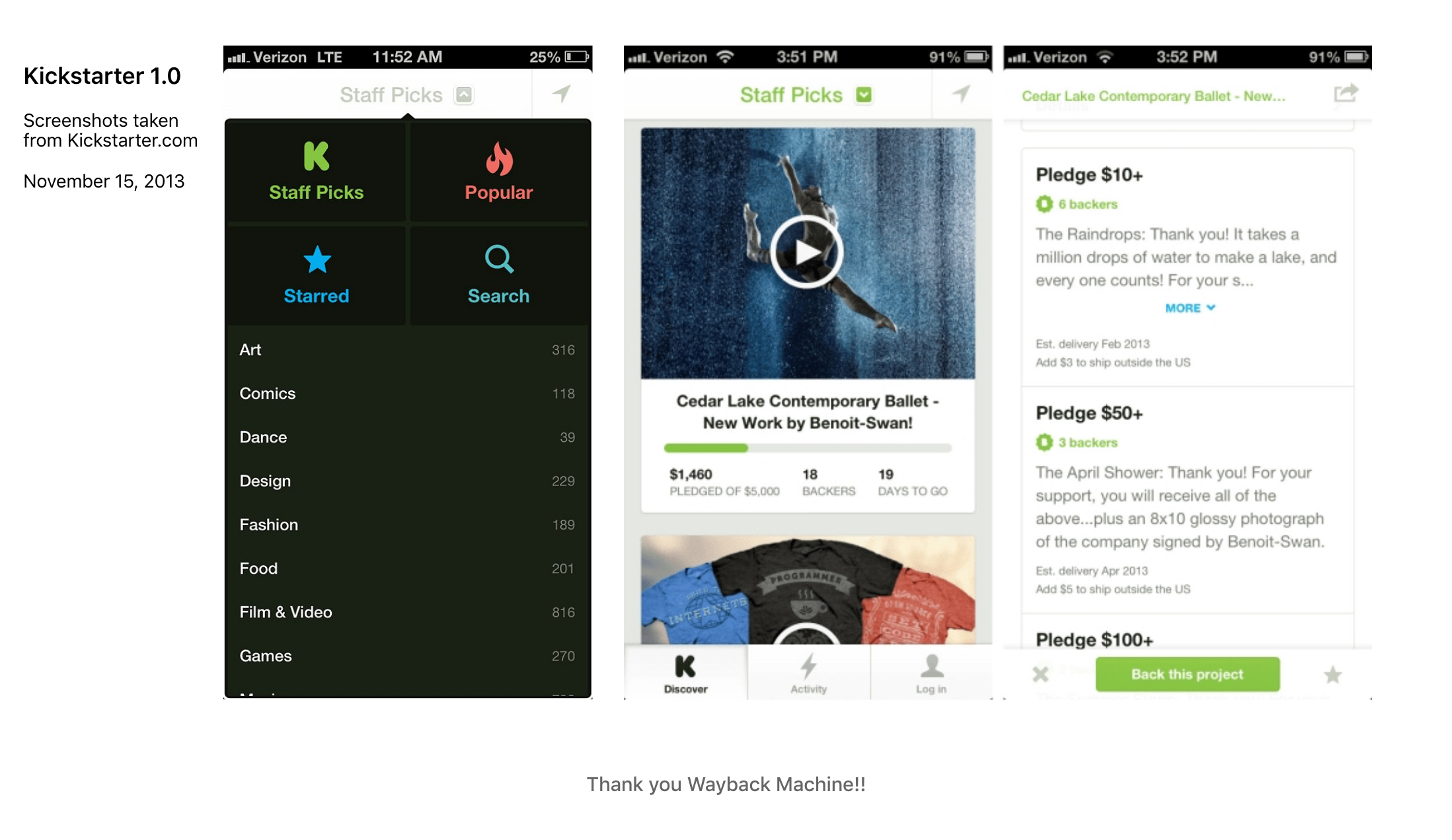
The original Kickstarter app for iPhone felt almost like Instagram or Vine, with a long vertical river of upcoming projects. That’s a great approach if people use your service only chronologically, but Kickstarter patrons navigate the site in a number of ways: by category, by popularity, by close date, and even randomly.
The new app design had a few advantages over the old version. For one, it was a much more distinctive-looking app. The entire UI was not only swipe-based, but consistent in orientation no matter where you were in Kickstarter’s navigation hierarchy (i.e. a swipe left or right always brings you to the next Kickstarter project, no matter where you are).
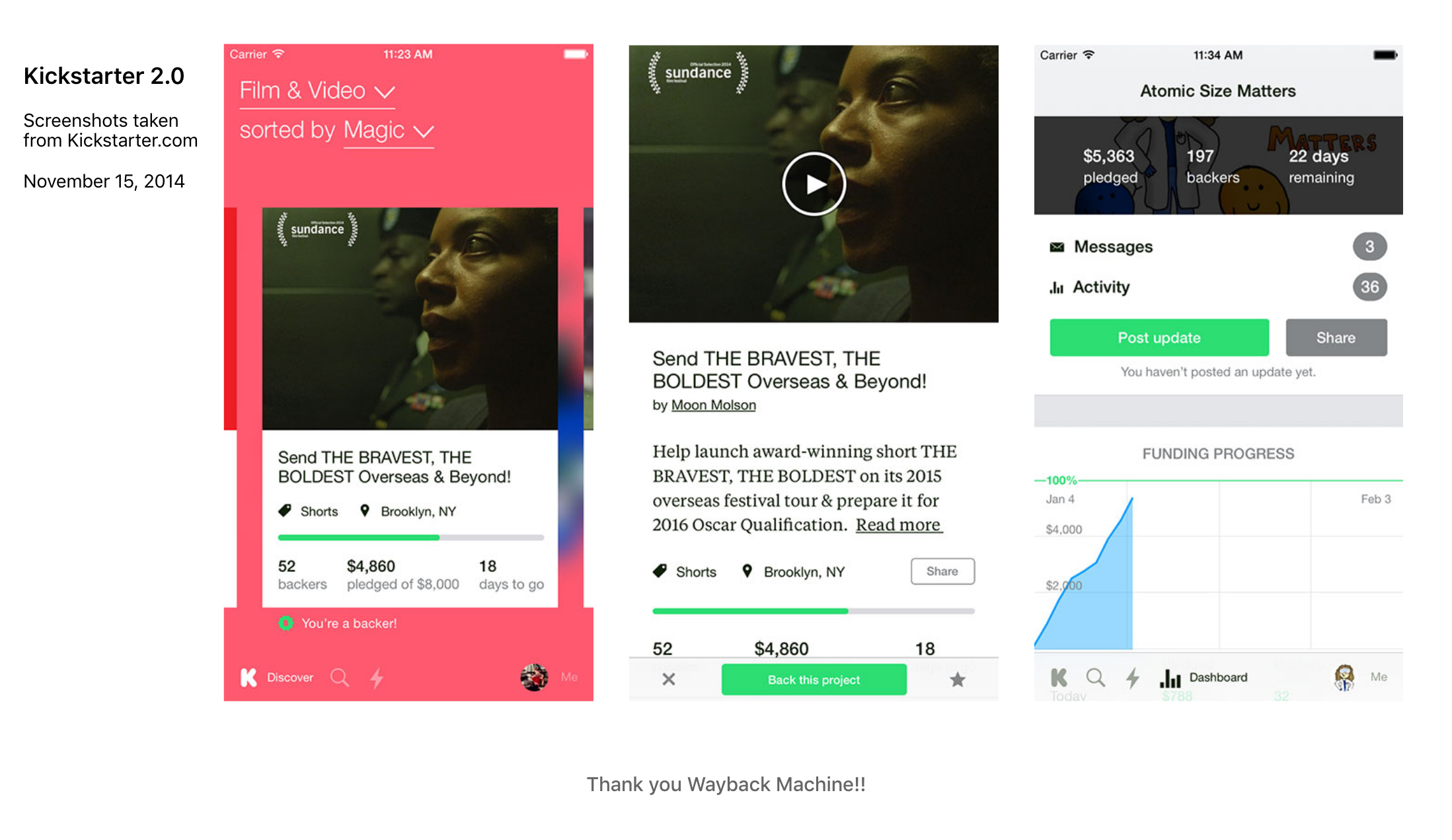
With iOS10, Kickstarter released a much-needed update based on the principles of Complexion Reduction.
While this new interface was much easier to navigate, I still felt that there was room for improvement. Despite its simplified color palette and enlarged typography, the interface felt cluttered, confusing and even claustrophobic at times.
I approached my redesign in three steps, while conducting research throughout:
- Core Navigation
- New Feature - Adding Campaigns
- Visual Interface
Core Navigation: Project Discovery
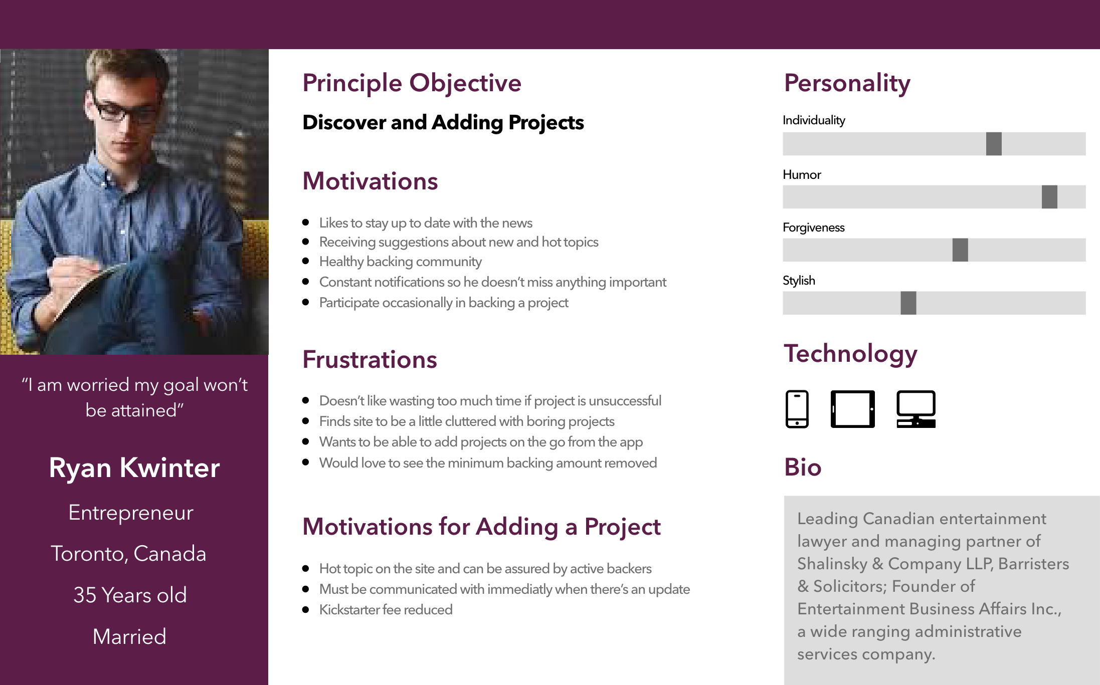
One of the first things that I found out was that users of kickstarters generally fell somewhere on the following user personas:
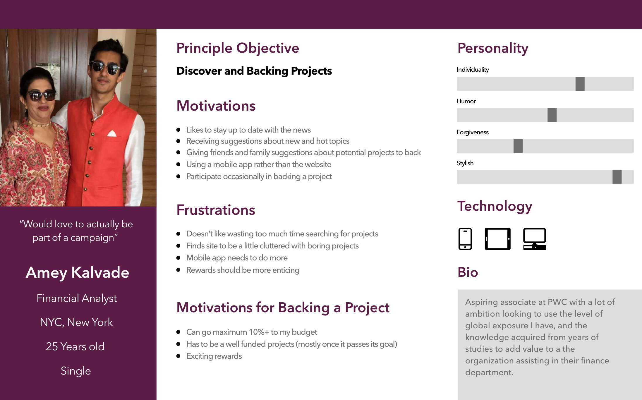
Project Backers:
- Browse all projects frequently to find the right project to back.
- Usually focused on the 'Most Funded' projects.
- Visual Interface is very important to the overall experience.
Project Campaigners:
- Browse all projects occasionally to find competitive campaigns to learn from and similar campaigns to judge public interest.
- Needs the entire catalogue to be mobile friendly so he can add/monitor projects on the go.
- Encouraged backers to support his/her vision is key.
While Project Campaigners are indeed more interested in adding and monitoring their campaign, they show signs of using the mobile app for browsing campaigns, be it for inspiration, lessons or just for fun. This coupled with the frequent use from the Project Backers makes the user task to find different projects using categories and subcategories all the more important.
Heatmap Analysis
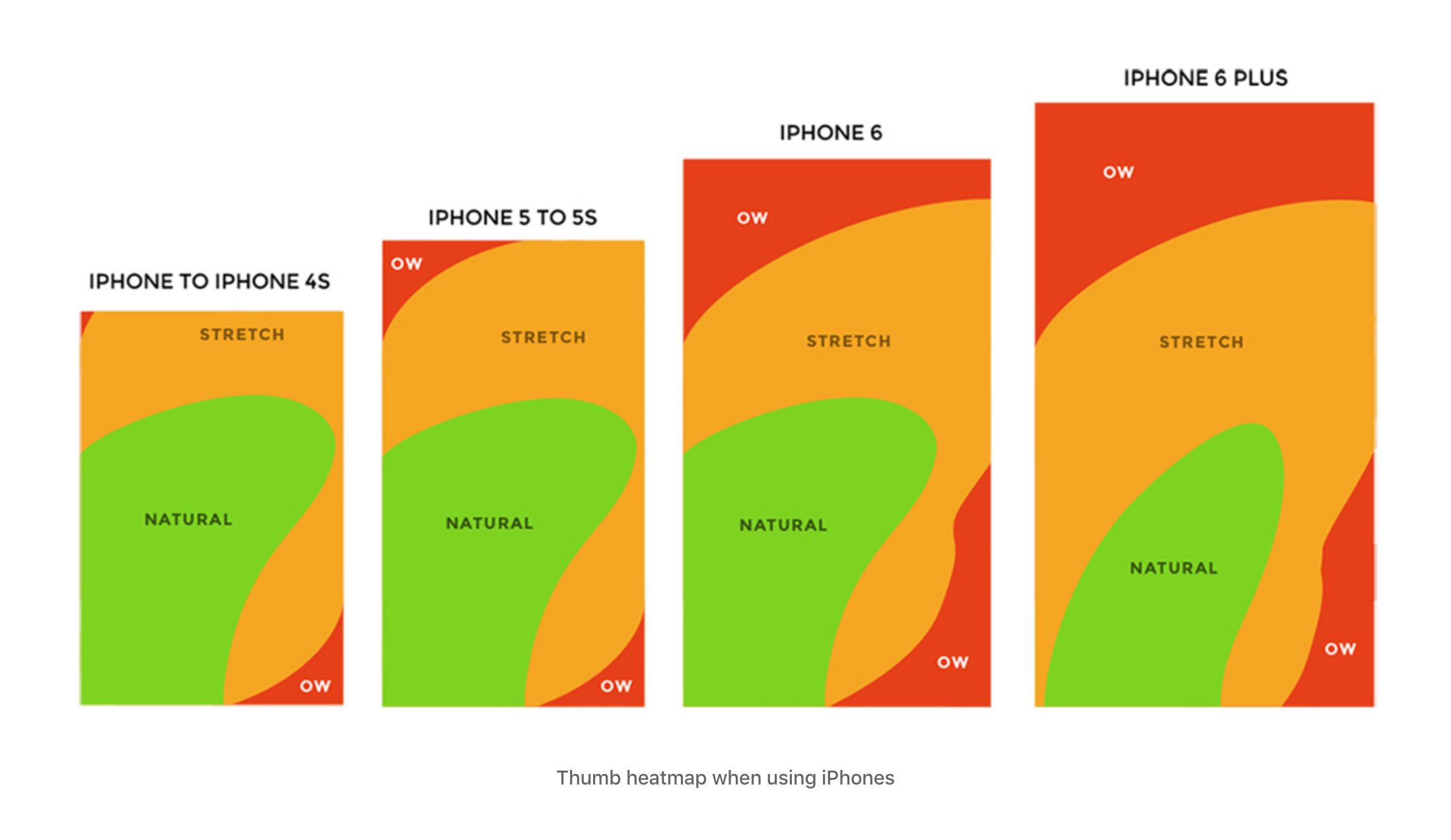
As you can see above, the heatmap clearly shows anything to do at the top of the screen is an uncomfortable gesture for the user. However, the current category selection is placed at the very top. Take a look below:
Treating the toolbar as a mechanism to discover new categories is an approach that makes sense given Kickstarters website information architecture. However, the way that users need to currently navigate to categories feels very tacked on. I found that users weren’t comfortable with reaching out to control the page from solely the top section. This led to an uncomfortable thumb position which over time served as a deterrent to switch categories.
If Kickstarter wants to expand to the project backers side of the spectrum, they have to do it in a way that brings their existing user base along. This means creating a category discovery experience centered around ease of navigation and clarity. Enter… updated navigation
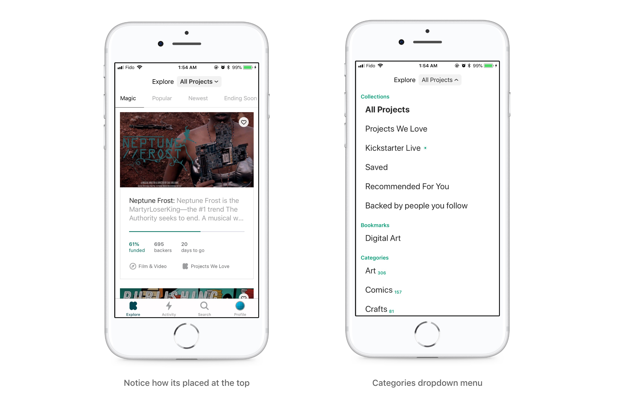
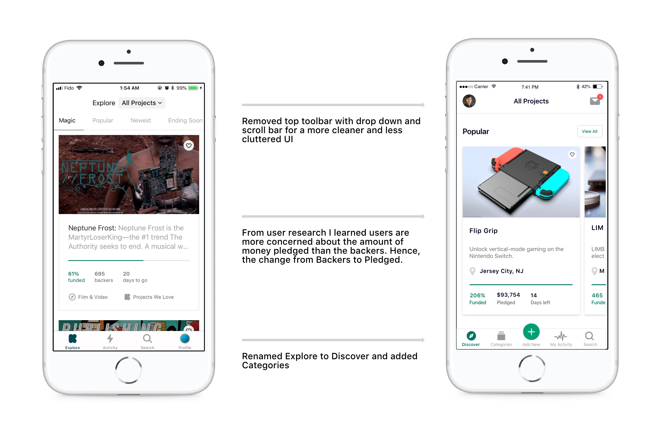
Updated Navigation
My updated navigation is a new experience made to bridge the gap between Backers and Contributors, replacing the current “top toolbar dropdown”. It was born out of the understanding that users who are picky about how they decide what category to select and what displays on their discover feed.
The scrollable bar under the toolbar was also not gesture friendly for users. According to Apple Design Guidlines, it is not recommended to add a top navigation and bottom in the same screen. Kickstarter however has three navigation channels on the same page which just leads to a cluttered page that ultimately leaves the users experience confusing.
A better experience would be presenting the categories as a whole new tab in the bottom navigation - which gives the user just enough flexibility to easily navigate to and decide the categories of their liking without stretching their thumb. The homepage was also redesigned to showcase the larger typography by segregating the page into 4 sections which were originally on the scrollable bar on the top.
Additionally the current inbox which was the only way for contributors to access information about their campaigns was nestled away inside the profile. Profile itself was extremely similar to Activity and did not need a seperate spot on the bottom navigation. Take a look at the current flow below:
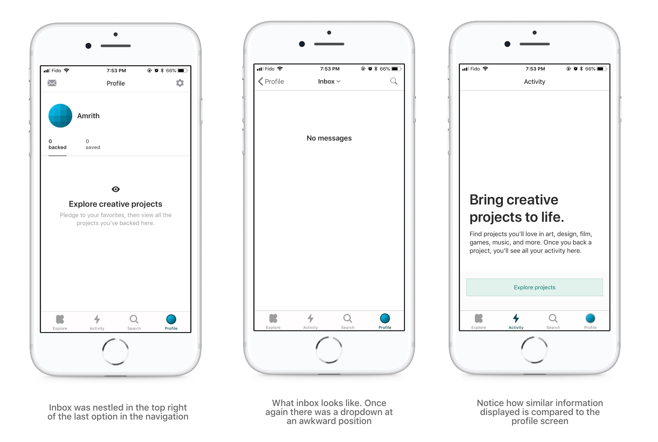
After looking at different options, I finally settled on bringing the profile and inbox right at the top of the homepage. I realize this goes against the arguments I have made above about uncomofortable gestures, however inbox and profile are pages not that often visited and thus will be less problematic for the user on the toolbar.
I have come to understand that, through a more user friendly bottom navigation, the user is able to establish an immediate connection to the projects they discover. In addition, the inbox moving to the front has the potential to provide the user a chance to interact with others all the while making it more user friendly for project campaigners. Eventually allowing the app to evolve and grow with the user.
New Feature - Adding Campaigns
One of the main concerns I heard from Project Campaigners was that they could not post campaigns on the go from their phone. They did acknowledge the mobile version of the website allows this but the font was too shrunken for them to enjoy the experience. After some user research and studying competitor models, I devised a unique user flow for the campaign setup wizard.
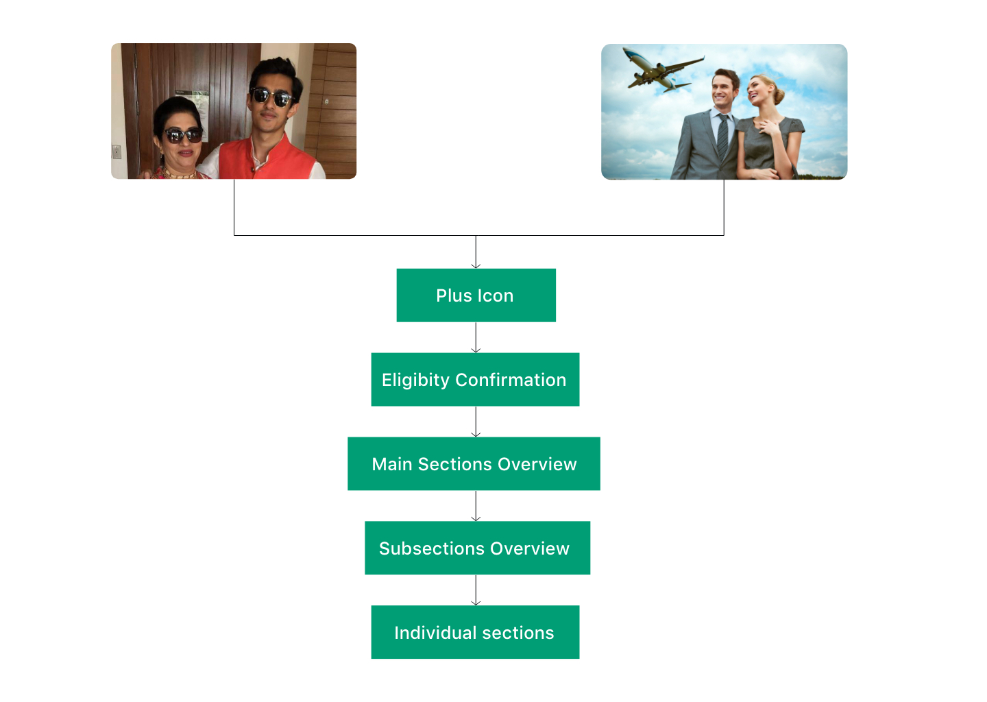
Once I devised the user flow, I did a couple of sketches and descended into the visual design. I'll be explaining each screen in detail below but to get started here are what the final screens will look like:
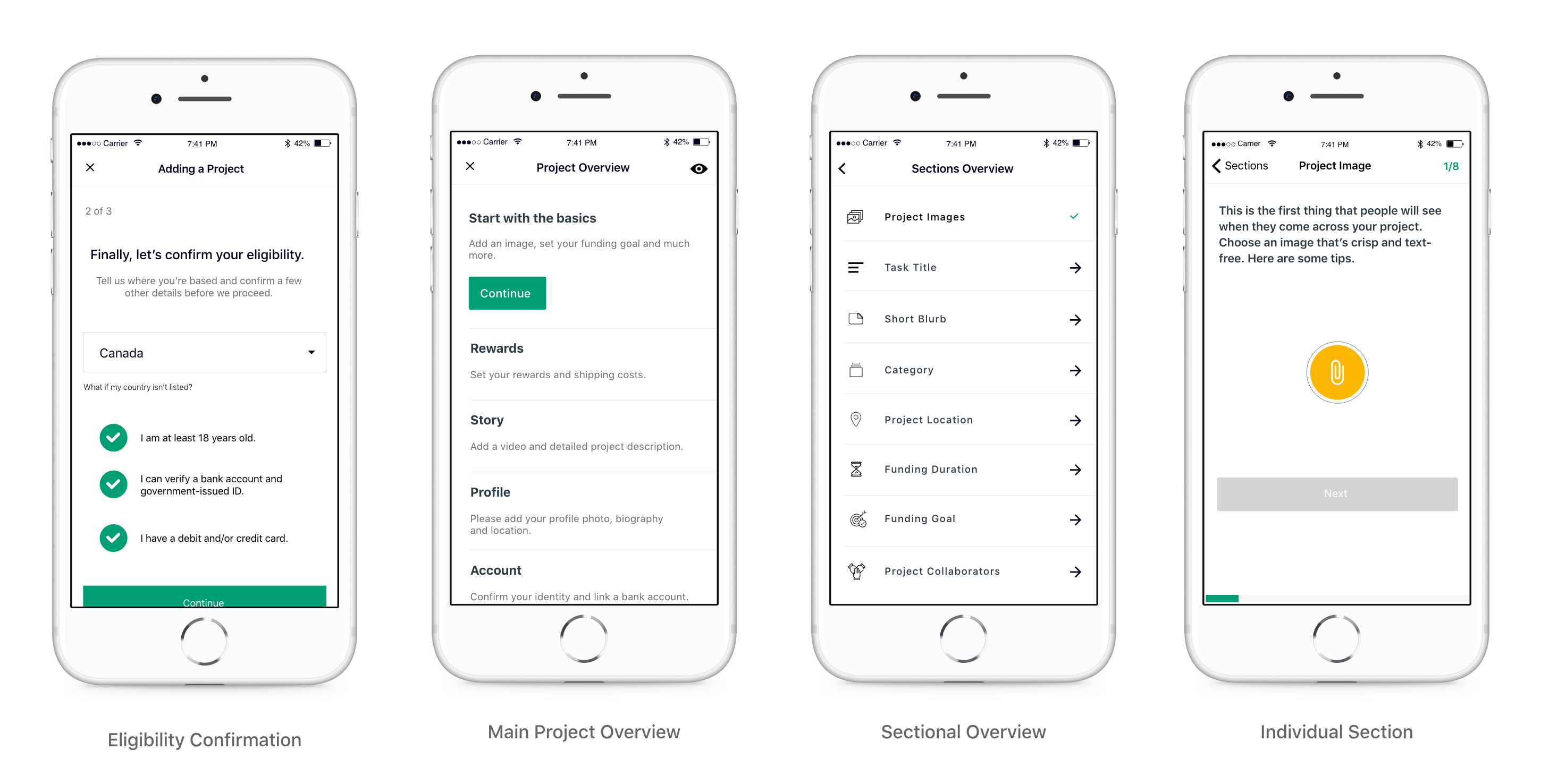
Eligibility Confirmation
I designed this section to be an almost exact replica to the websites user flow including the marketing screen to explain the benefits of campaigning with Kickstarter. The reason being is to continue brand familiarity across platforms. There are three steps to elgibility confirmation following which the user is directed to the main project overview.
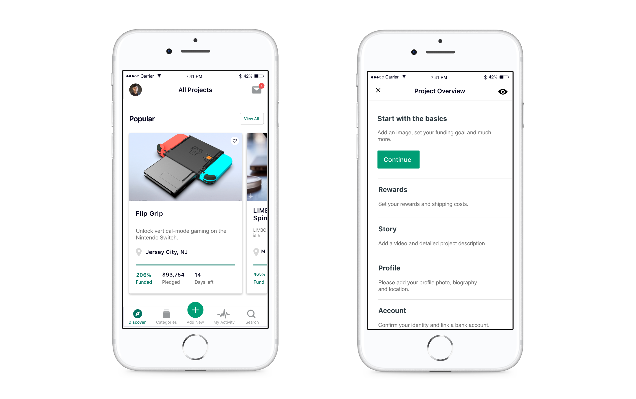
Project Overview
The project overview is a one stop editor to jump between the five different sub sections. The overview gives the user the flexibility to jump in and out of a sub section and also at same time have their progress saved automatically saved.
Subsection overview & Individual section
From the subsection overview, users can criss cross between different individual sections. This benefits the user by allowing them to tackle sections they are comfortable with and tackle the more challenging ones in their own time. As always all progress is automatically saved for future use.
Full Campaign Wizard animation
Just to bring the whole thing together, please find the entire campaign adding experience below (apologies for the long video).
Visual Interface
General Improvements
The chief complaint I heard about the current interface was that it felt too sterile and lacked an element of delight. To begin resolving this, I optimized white space through subtle app-wide adjustments as demonstrated below:
Campaign expanded
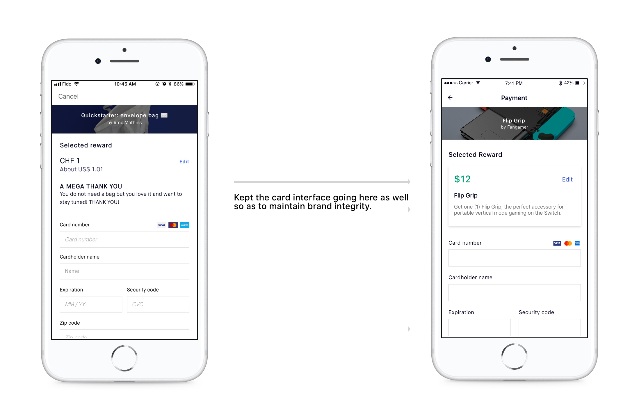
Upon clicking a card on the discover page, users are directed to the campaign information page. From user research I learned users were most concerned about only reading about the rewards in store for them if they decided to back the campaign. However, the reward section was in the bottom of the screen accessible only through a slight scroll. The scroll also blocked the second most important aspect - The snapshot data. Take a look below to see how it currently is:
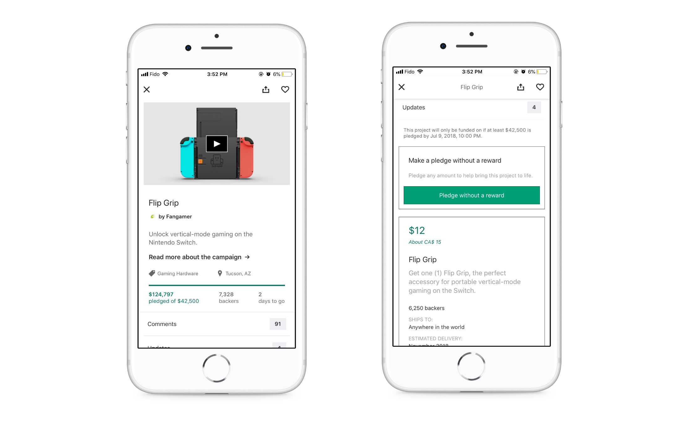
The redesign uses the principle of Segmented Controls. This ultimately allows more clarity and forces more interactivity with the screen from the user.
Reading more information
Users had a very useful section navigator at the top of the screen however upon scrolling down the navigator gets hidden forcing the user to scroll up for at times nearly 3-4 seconds before reaching the top. Take a look below:
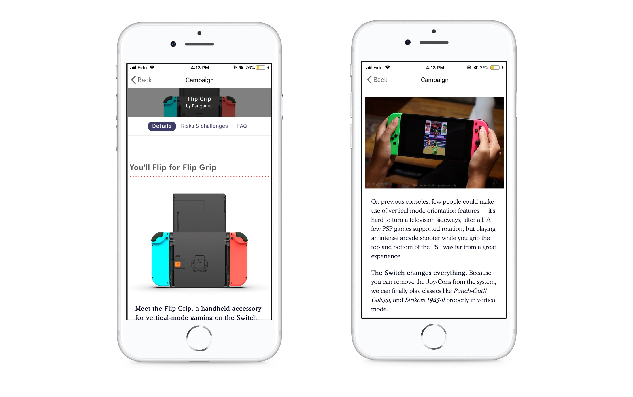
I did not change much to this screen - cleaned up the navigator and made it a fixed position on scroll.
Search experience
The search was nearly perfect, the only issues users faced was the inifinite scroll. They were discourged to keep scrolling past the second page to find relevant campaigns to their liking. Take a look below:
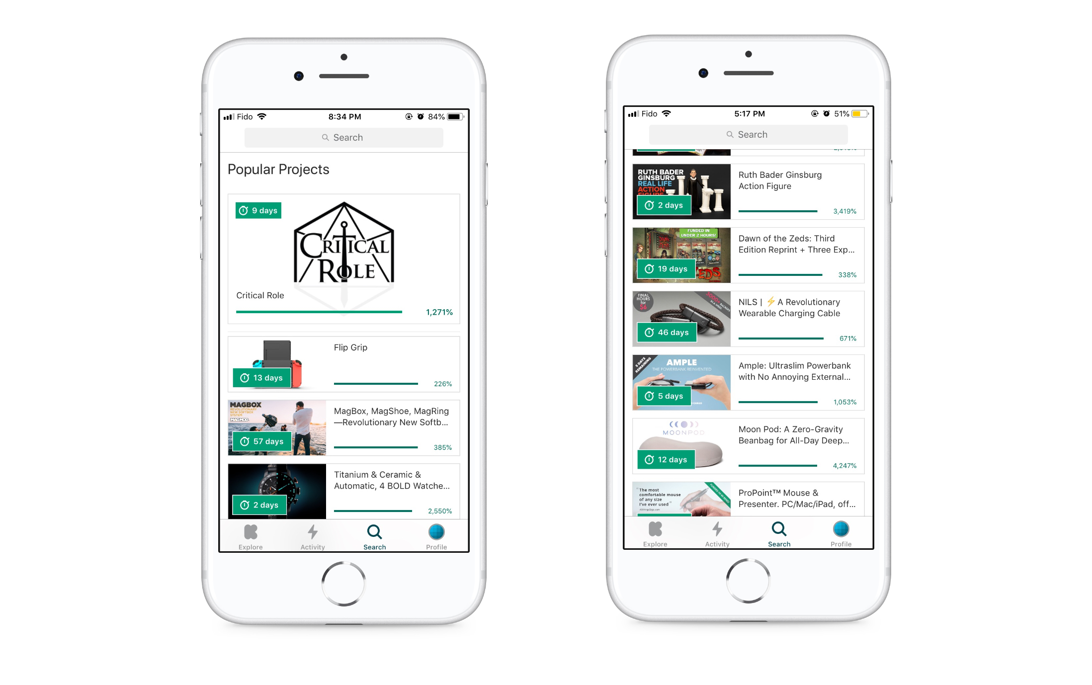
Once again the redesign uses the principle of segmented controls. I introduced three sections - Most popular, Most funded & Ending soon. With these controls users are not simply scrolling down a screen but can spend time on projects that are relevant for them.
My Activity
My activities was redesigned to solely show the updates regarding uploaded campaigns. The reasoning behind is, both sets of users can be encouraged to start a campaign while strentegning the mobile reach for project campaigners. The addition of this feature doesn't change the current experience for project backers/discoverers, hence it will not affect their usage.
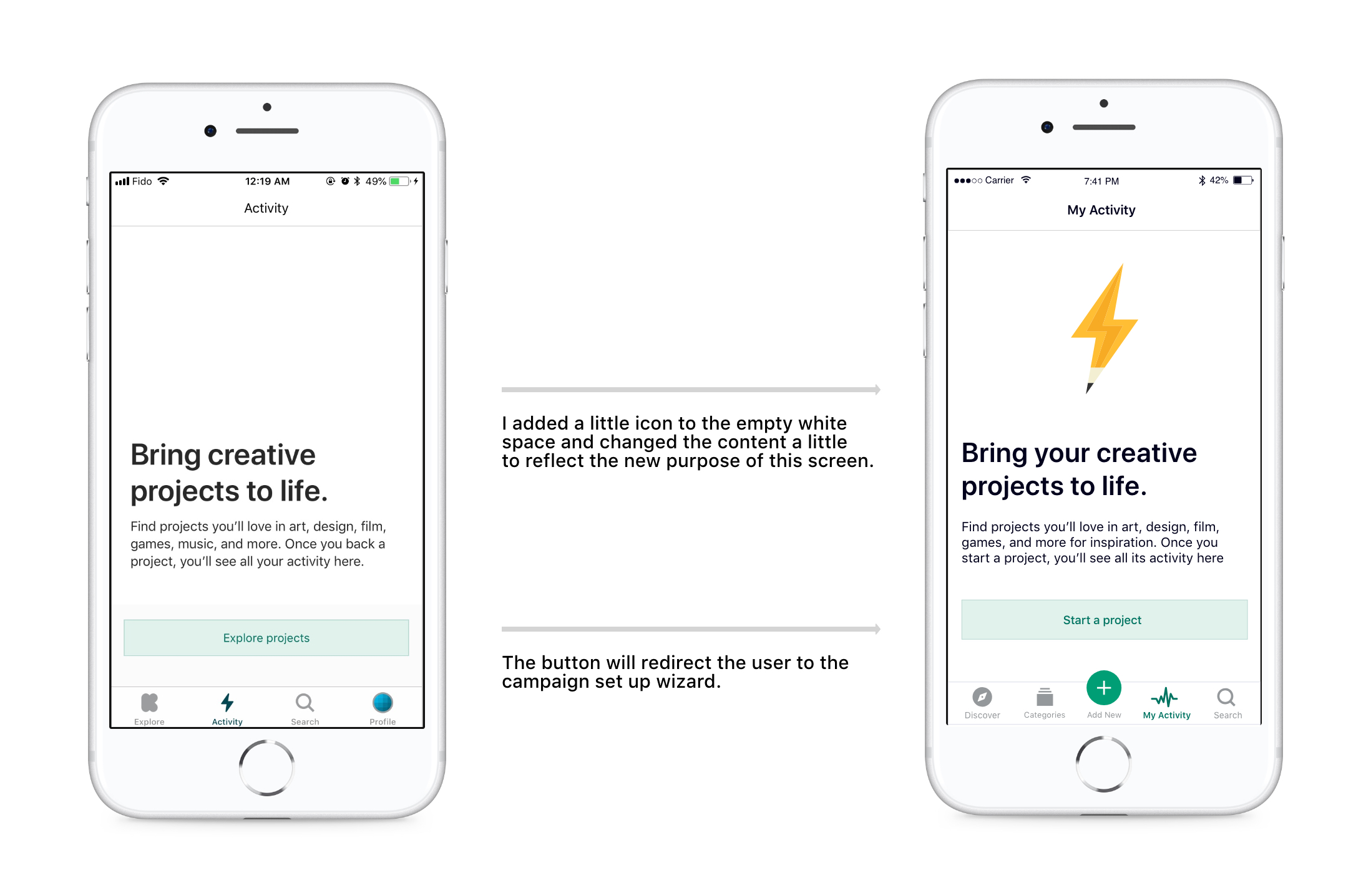
As activities were redesigned primarily only for Project Campaigners to check on their projects, to see backed projects, users can easily navigate to their profile from the home page. The screen has two sections - Live Campaigns & Campaign History. Users can toggle between the options using a segmented control as shown below:
Conclusion
Looking back at the initial scribbles I made on my notebook during my initial brainstorming sessions, I’m happily surprised at the amount of progress I was able to make in one month.
Through this project, I have come to understand the value of my product management background in relation to UX design — experience designers and product managers are alike in their shared understanding of human empathy.
All Kickstarter logos and references are property of Kickstarter, and used here for demonstration purposes only.